Med Spa Brand Identity Design | Icon Aesthetics Rebrand
See how Arizona nurse injector Trista McClane went from 15 fonts and Canva templates to a polished brand identity with old Hollywood glamour. (View the full brand here)
Picture this. You walk into a beautiful studio. Soft lighting, a comfy chair, and an expert who actually listens to what you want. You leave looking like yourself on your very best day.
Then you pull up her Instagram… and it looks like five different businesses took turns posting.
That was Icon Aesthetics before we started working together. The experience was five-star. The brand was still catching up.
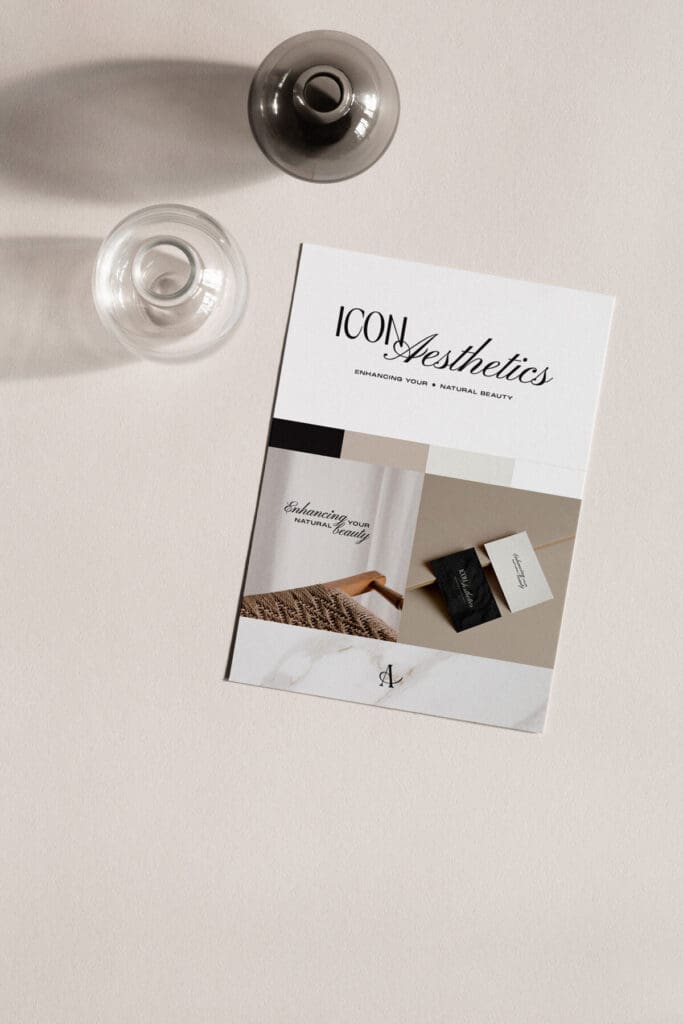
Trista McClane built Icon Aesthetics in Arizona, where she works as an advanced nurse injector and laser specialist. Her clients rebook every few weeks like clockwork, and most new faces walk in because a friend sent them.
What keeps them coming back is how she listens. Every treatment starts with a consult, and every plan gets built together. The goal is always the same: look like yourself on your best day, not like you “had work done.” Her tagline says it best: Enhancing your natural beauty.
And here’s my favorite detail. This wasn’t our first project together. Trista came back to me for branding her studio after designing a personal brand for her a few years prior to that, and in this business, there’s no bigger compliment than that!
When Trista filled out my questionnaire, she put it perfectly:
“I feel like the vibe of my studio space doesn’t remotely match what my mind wants my branding to look like.”
She was using about 15 fonts at once. Her graphics came from whatever Canva template caught her eye that day. Each piece was cute on its own, but together? It was like showing up to a black-tie dinner in a ballgown, flip-flops, and a ball cap.
Trista has great taste. What she didn’t have was the plan behind it (the why that ties everything together). And honestly, designing a brand was never supposed to be on her to-do list. She’s busy running a full schedule of clients.
This is why I think so many med spa brands miss the mark:
Most med spa brands end up in one of two avenues.
In the first avenue, the brand looks like a doctor’s office. Cool blues, plain block letters, maybe a little needle tucked in the logo. It says “safe,” but it doesn’t make anybody excited to book. Nobody daydreams about their doctor’s waiting room!
In the second avenue, the brand looks like a girls’ spa day. Pastel pink, swirly script, cucumber-water vibes. It’s sweet, but when you’re about to let someone put a needle in your face, sweet isn’t what you need. You need to know she knows exactly what she’s doing.
Her clients want both at the same time: she’s a real medical pro, and I deserve this. Trista’s brand needed a third avenue, and that’s right where we went.
These were my bullet points from my own notes while designing this med spa brand:
- Fonts with a little backbone. A classic serif (the kind with tiny feet on the letters) says trustworthy and established without feeling cold.
- A short color list. Two to four colors, mostly warm neutrals, with one bold shade to ground it all. For Trista, that’s Ivory and Champagne, anchored by Espresso Noir.
- Room to breathe. Plenty of open space around everything, so nothing feels crowded or crammed together.
- Real photos. Her actual face, her actual studio, her actual results. Stock models just make people wonder what you’re hiding and don’t cut it.
Think less hospital, less nail salon, and more like checking into a beautiful old hotel spa where the front desk already knows your name.
What we built: a med spa brand identity where every piece has a job
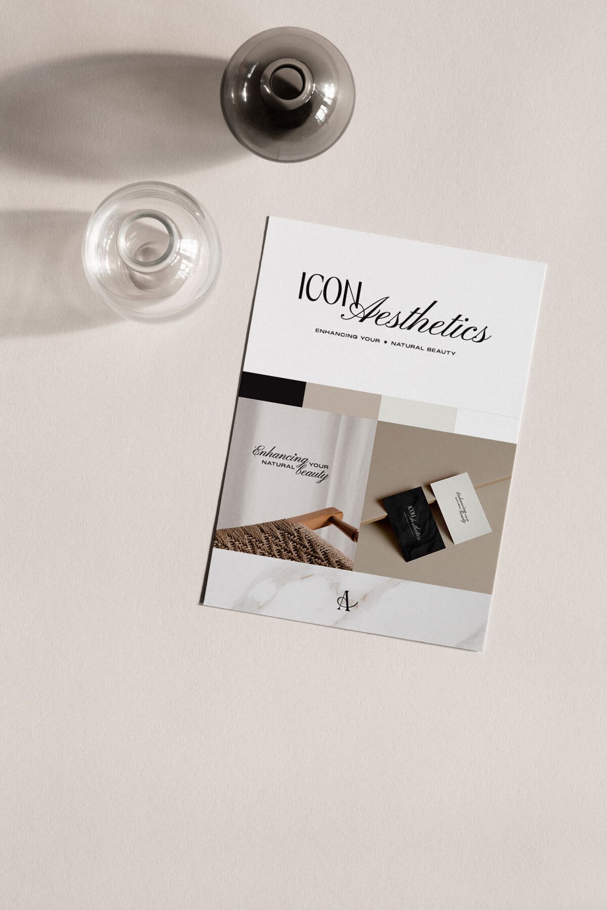
Nothing in Trista’s brand is there just to look pretty. Every choice I made had to pass one test: does this say she’s a real medical pro and I deserve this at the same time? That’s why you won’t find blush pink or swirly script (too spa day), or cool blues and plain block letters (too doctor’s office). Instead, I kept the palette to three warm colors, paired an elegant serif with a retro display font, and gave everything plenty of room to breathe. Here’s each piece and the job I gave it.
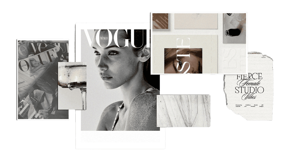
The feeling we wanted? Luxurious, refined, sophisticated, and editorial, with a touch of old Hollywood glamour.
Why those words? Old Hollywood glamour is all about enhancement: the polish, the glow, the sense of being your best self. Refined and editorial keep things natural. Nothing is loud or overdone, and everything looks intentional. That’s the same promise Trista makes in the treatment room. She doesn’t change who you are. She brings out what’s already there. We wanted her brand to do the same, so it would feel like both her studio and her.
The primary logo is polished, classic, and expensive-feeling without shouting. It’s the first promise her clients see before they ever book.
The logo variations keep her recognizable everywhere, from a tiny Instagram profile circle to the front of her studio door, so the main logo never gets squished into a space it wasn’t made for.
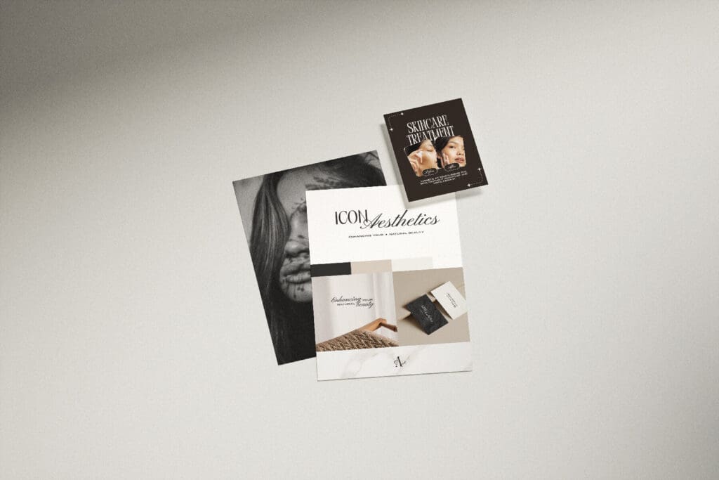
The color palette does a lot of quiet work. Ivory feels clean and trustworthy, the way a medical studio should. Champagne adds the glow. Espresso Noir brings the drama. Together they say “real medical expertise, wrapped in glamour.”
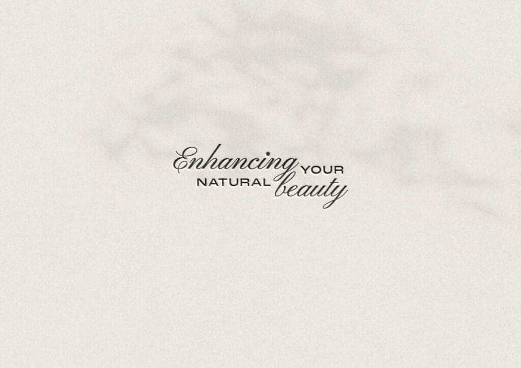
The embossed tagline puts her whole philosophy right in someone’s hand. Pressing “Enhancing your natural beauty” into the card makes it something you feel, not just read, the same way her work is subtle but noticed.
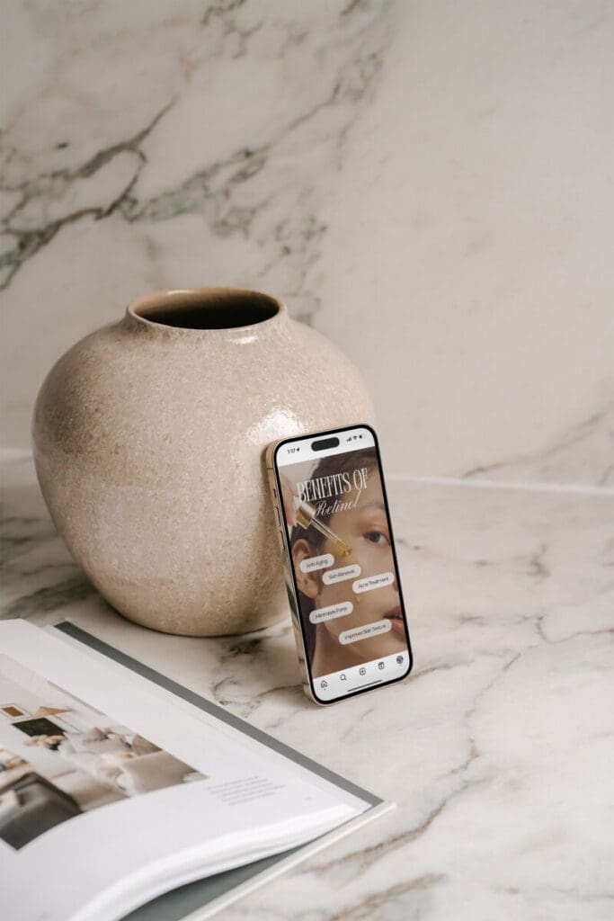
Instagram post and story templates mean every post looks like it came from the same studio, even on her busiest days. No more starting from a blank screen between appointments.
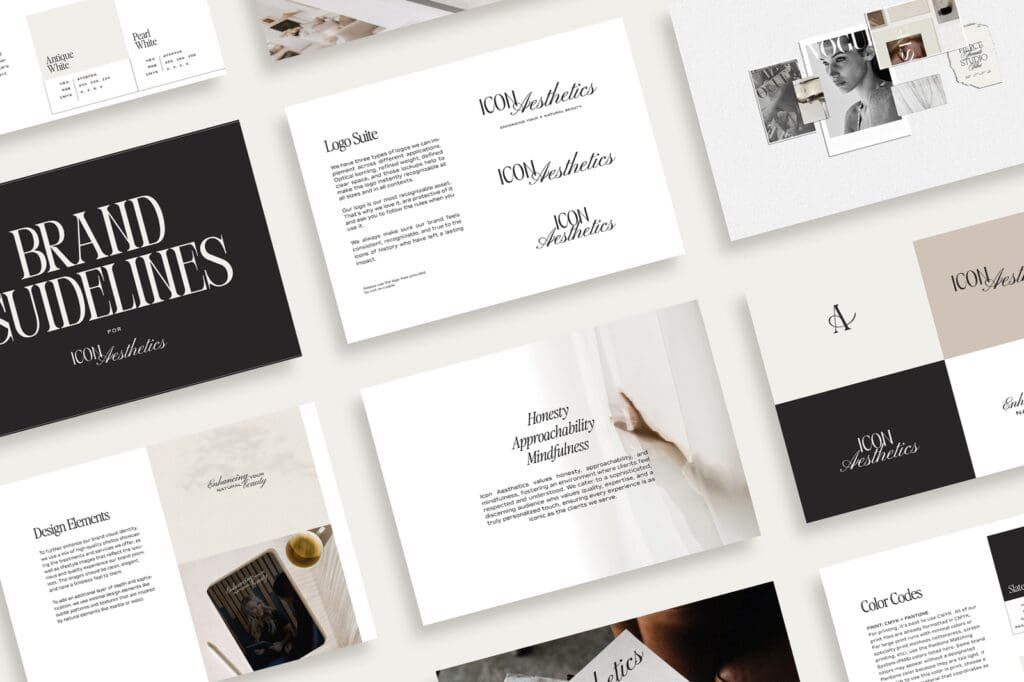
The brand style guide is her rulebook. Anyone she hands the brand to (a printer, an assistant, a future web designer) can get it right without her having to explain a thing.
My favorite part:
Honestly? The font pairing.
I matched a retro display font with an elegant serif, and those two together hold the whole personality of the brand. The retro font brings the old Hollywood glamour. The serif keeps it refined and trustworthy.
On its own, one would read too playful and the other too buttoned-up. Together? Timeless with a little wink.
And remember those 15 fonts? We traded them for two that actually work together. Less really is more.
In Trista’s words:
“Kelbey is not only creative, she’s a designing pro and amazing at what she does. I knew having Kelbey do my rebranding was not only going to make my life easier, she was going to create the exact look I was going for. Kelbey’s questionnaires help pull things out of you to allow her to be a design genius. This is my second time having Kelbey design a logo/brand for me and both times, she nailed it!”
If you’re shopping around for a brand designer, here’s what a full med spa brand should cover:
- A main logo, plus backup versions for small or odd-shaped spaces
- Font rules, so you know which font goes where
- Your colors, plus how much of each to use
- Photo guidelines, especially for before-and-afters, so your results stay honest and consistent
- A voice guide that keeps your wording warm without overpromising results
- Templates for the things you use every week: treatment menus, gift cards, social posts, room signs, and emails
When all of that is done right, your Instagram, your front desk, and everything in between tell the same story.
Ready for a brand that matches your best work?
Every project I take on starts the same way yours probably will. A business owner with a folder full of half-ideas, a Pinterest board she can’t quite explain, and a gut feeling that her current brand isn’t cutting it.
If that’s you, I’d love to hear about it. Take a peek at the full Icon Aesthetics case study, then tell me about your business. Let’s build a brand that finally says what your clients already know.