
A few years ago, I designed Robin’s very first logo — a delicate handwritten font paired with her tagline. At the time, it was perfect for that season of her career. But as Robin’s reputation and clientele grew, she realized her brand needed to evolve too. She wanted a look that reflected the level of sophistication, maturity, and professionalism her clients had come to expect.
That’s when she came back to me for a complete brand identity overhaul.
Discovery: Knowing When It’s Time for a Change
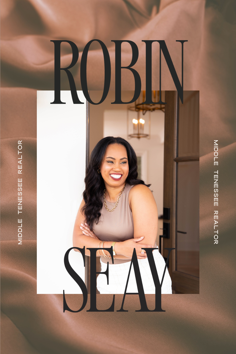
Robin is an award-winning real estate agent in Middle Tennessee. Her service is top-notch, but she found herself struggling to consistently attract the right kind of clients — those seeking a white-glove, one-on-one home buying experience.
She was even featured in Nashville Voyager in 2025 and was also interviewed for the Daily Inspiration series back in 2021 for crying out loud!
She knew exactly who she wanted to reach, and she had a clear sense of how her brand needed to show up: elevated, luxurious, but still approachable and warm. That clarity made this project such a dream to work on. With her vision in mind, I had both the strategic direction and the creative freedom to bring it to life.
Creative Direction: Setting the Stage
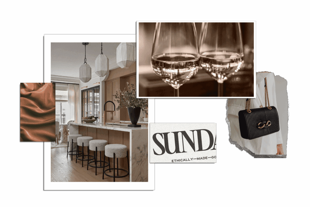
We kicked things off with research and inspiration, starting with a brand discovery session where I pulled keywords from Robin’s vision and her ideal client profile. Words like luxury, timeless, approachable, and confident became our anchors.
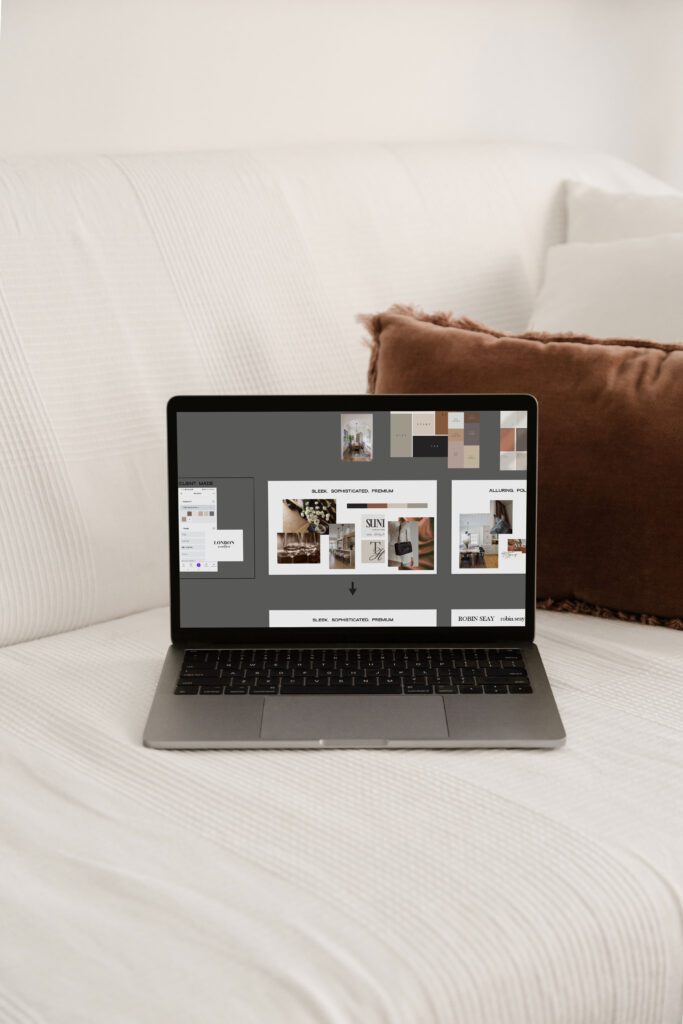
From there, I created two distinct mood boards, each designed to visually express these qualities in different ways. One leaned heavily into clean editorial typography, silky textures, and high-contrast neutrals that conveyed professionalism and sophistication. The other explored softer tones, organic details, and warmer accents to emphasize approachability and trustworthiness.
This is where the psychology piece comes in:
- Color psychology: We know deep, muted tones (like charcoal and navy) communicate reliability and professionalism, while warmer neutrals soften the overall feel, making the brand more inviting.
- Buyer psychology: Robin’s ideal clients are seeking not just a transaction, but a high-touch experience. That meant leaning into cues of luxury and exclusivity — think silk textures, refined fonts, and minimalist layouts that feel polished yet personal.
- Keyword pairings to visuals: For example, “timeless + confident” translated into strong serif fonts with classic structure, while “approachable + friendly” showed up in open kerning and rounded submark details.
After presenting both boards, Robin was immediately drawn to one direction. That choice became our guiding star — a visual identity rooted in sophistication with a welcoming edge, perfectly mirroring the experience she offers her clients.
Design Refinements: Finding the Perfect Fit
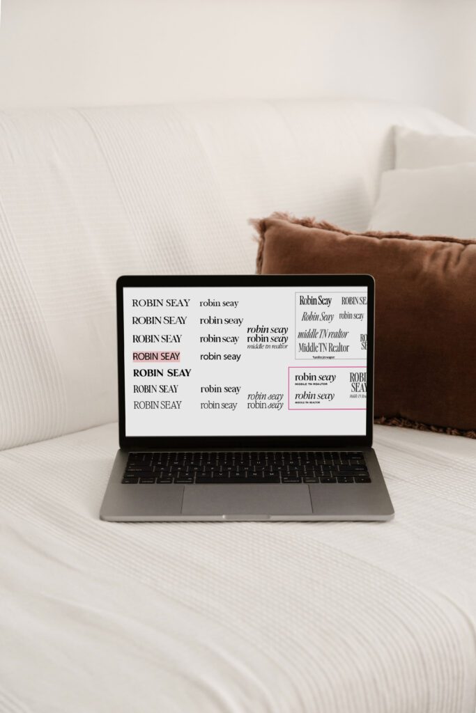
From there, I dove into the logo design process. After testing countless fonts and layouts, I narrowed it down to two strong contenders. Both captured the essence of Robin’s brand, so I shared both with her to make the final call.
Together, we refined the details — adjusting spacing, line weight, and overall balance — until we landed on the perfect mark. The result was clean, classy, and effortlessly sophisticated.
The Big Reveal: A Brand That Matches Her Service
The final brand identity is everything Robin envisioned: stylish, confident, and inviting. It speaks directly to the high-end clients she serves while still reflecting her approachable personality.
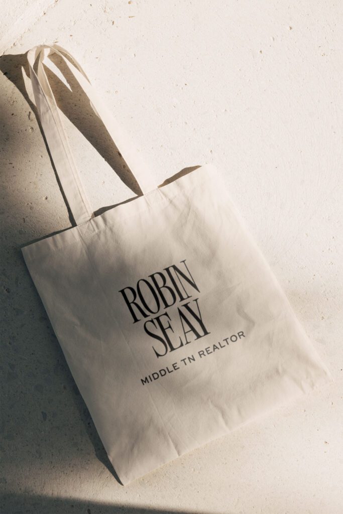
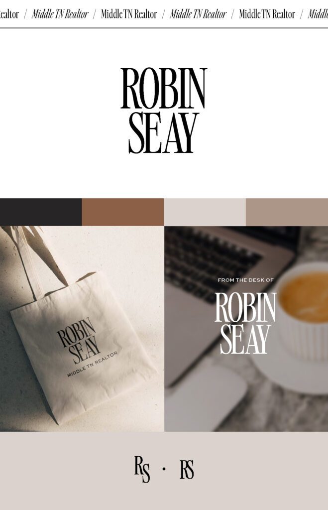
Below are a few images to get the overall feel of her brand. You can also check out more details in my portfolio here.
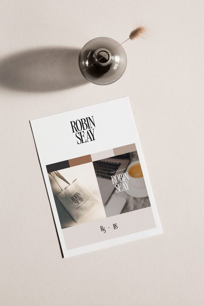
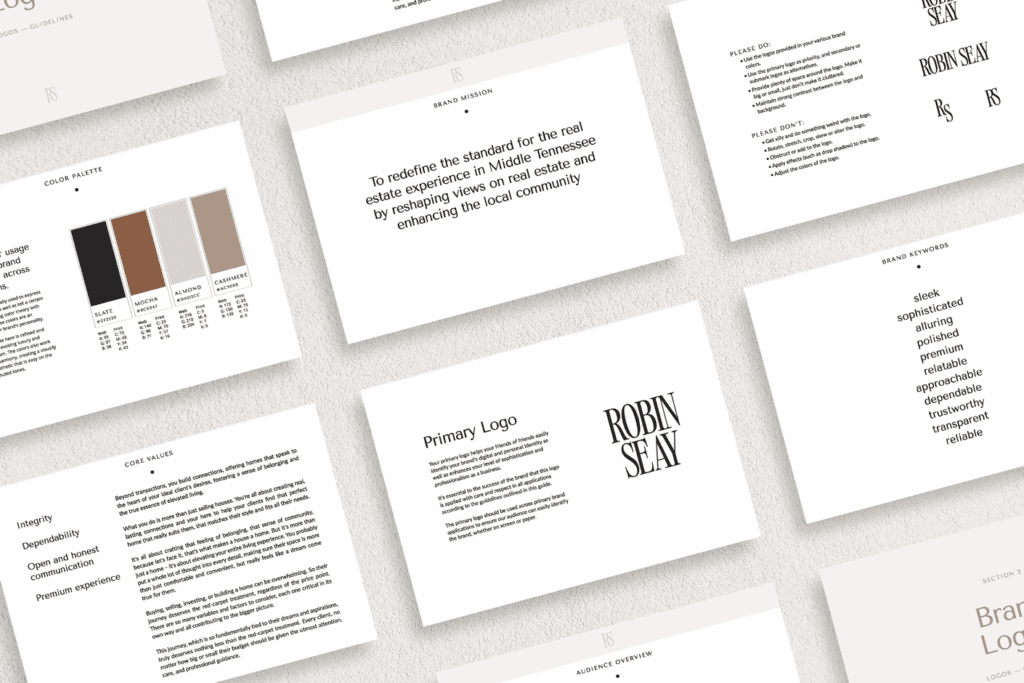
Here’s what she walked away with in her Mini Brand Identity Starter Kit:
- Inspiration board packed with imagery and color direction
- Primary logo (with and without tagline)
- Submark + monogram for versatile brand use
- Strategic color palette designed for consistency and impact
- Font pairings + usage guide for cohesive visuals
- Quick reference brand sheet (a one-page snapshot of her brand)
- 15+ page brand guidelines to keep everything on track
- File usage guide so she always knows which file type to use where
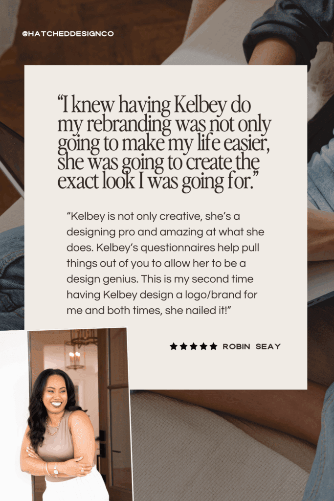
What Robin Had to Say
Why This Matters
For Robin, this wasn’t just a new logo. It was a brand identity that finally matches the level of service and experience she provides. Now, when clients encounter her brand, they’ll immediately sense the professionalism, trust, and luxury she delivers.
That alignment creates a whole new level of confidence — the kind that not only attracts the right audience, but also empowers Robin to keep growing her business.
And honestly? That’s my favorite part of what I do.
→ Image source + mockups used here are purchased from Moyo Studio
*Small heads up — some of these links are affiliate links. That means I might get a small commission or discount on my subscription, while also hooking you up with a discount too! You’ll also be supporting my coffee addiction fund 😄☕️